Cadence Publication
Publication Design
Visual Identity
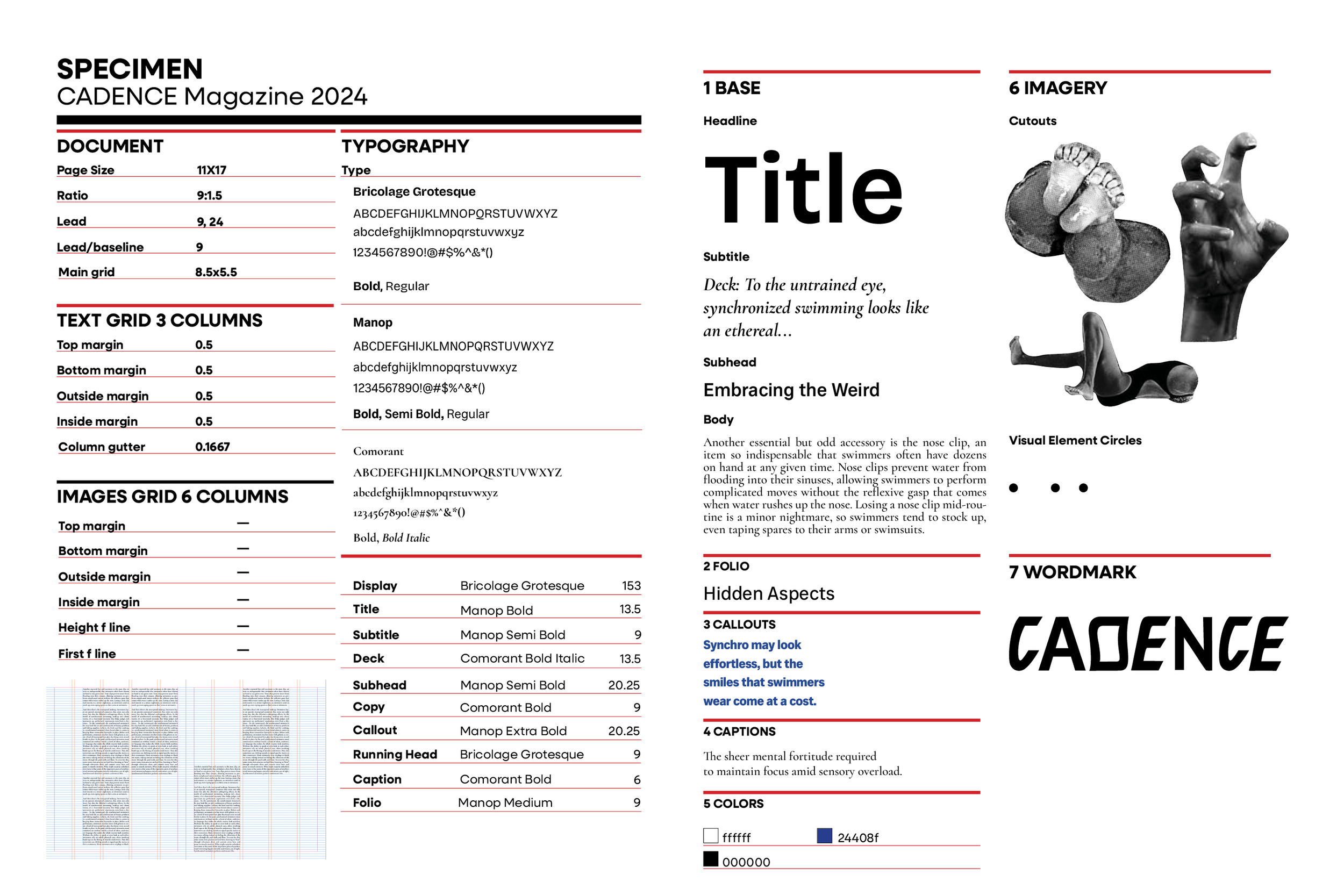
Typographic Exploration
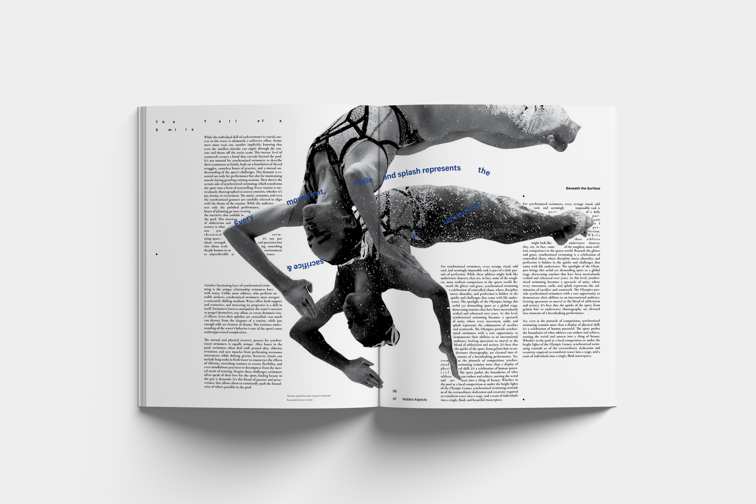
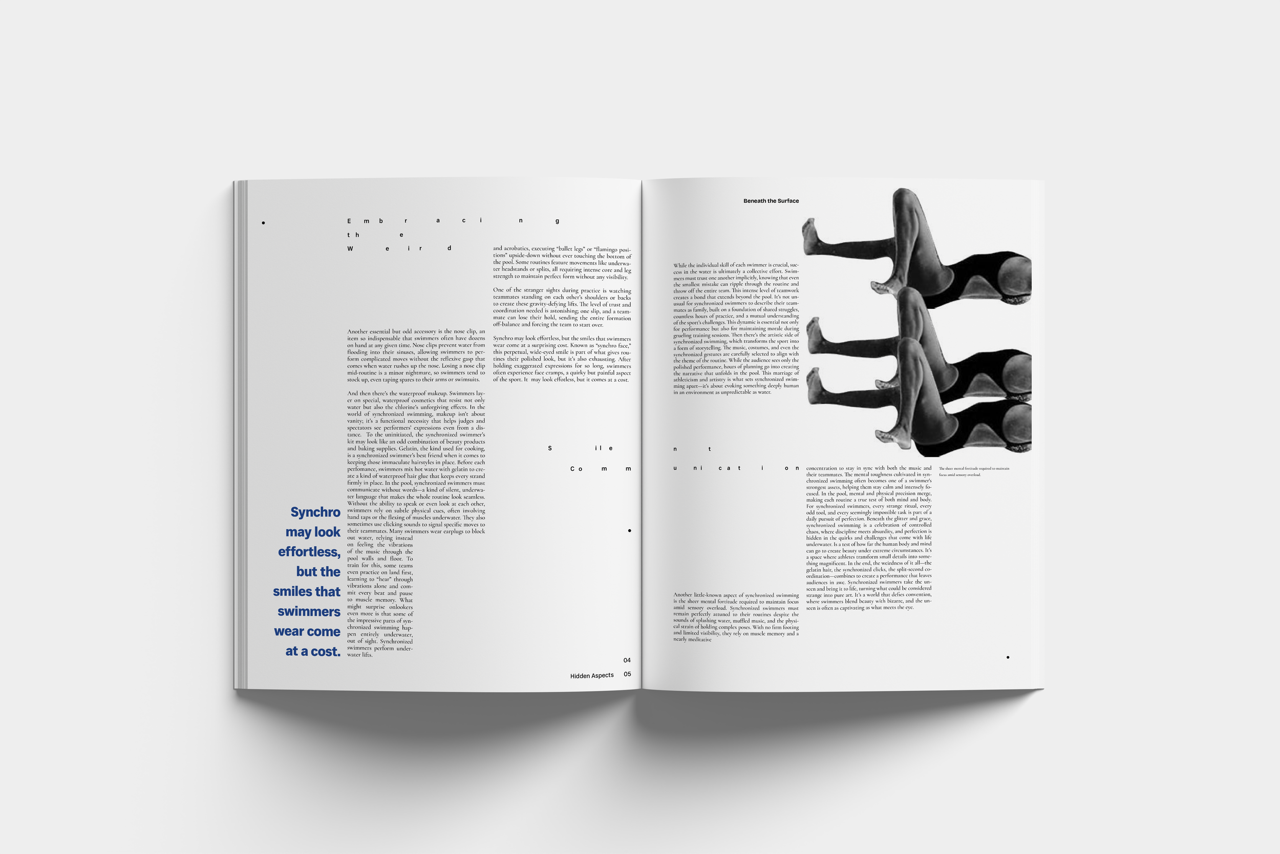
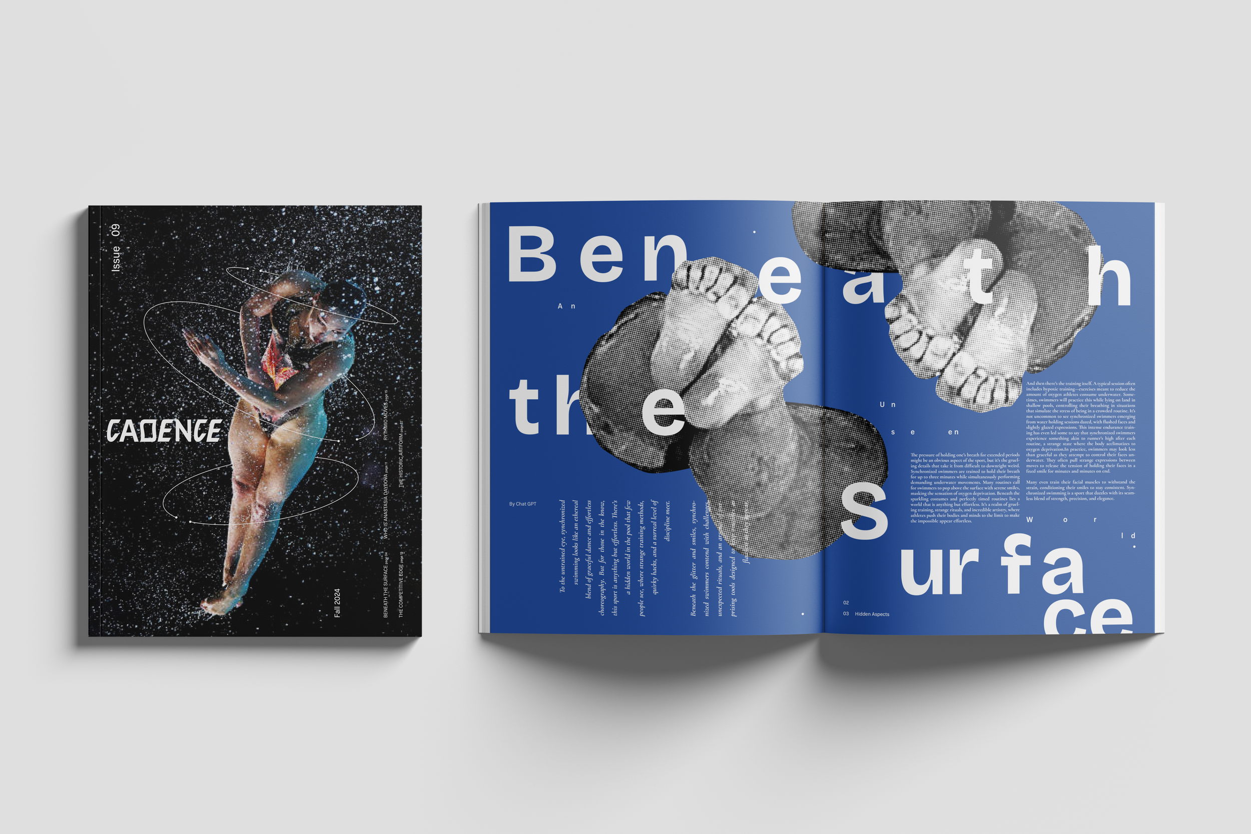
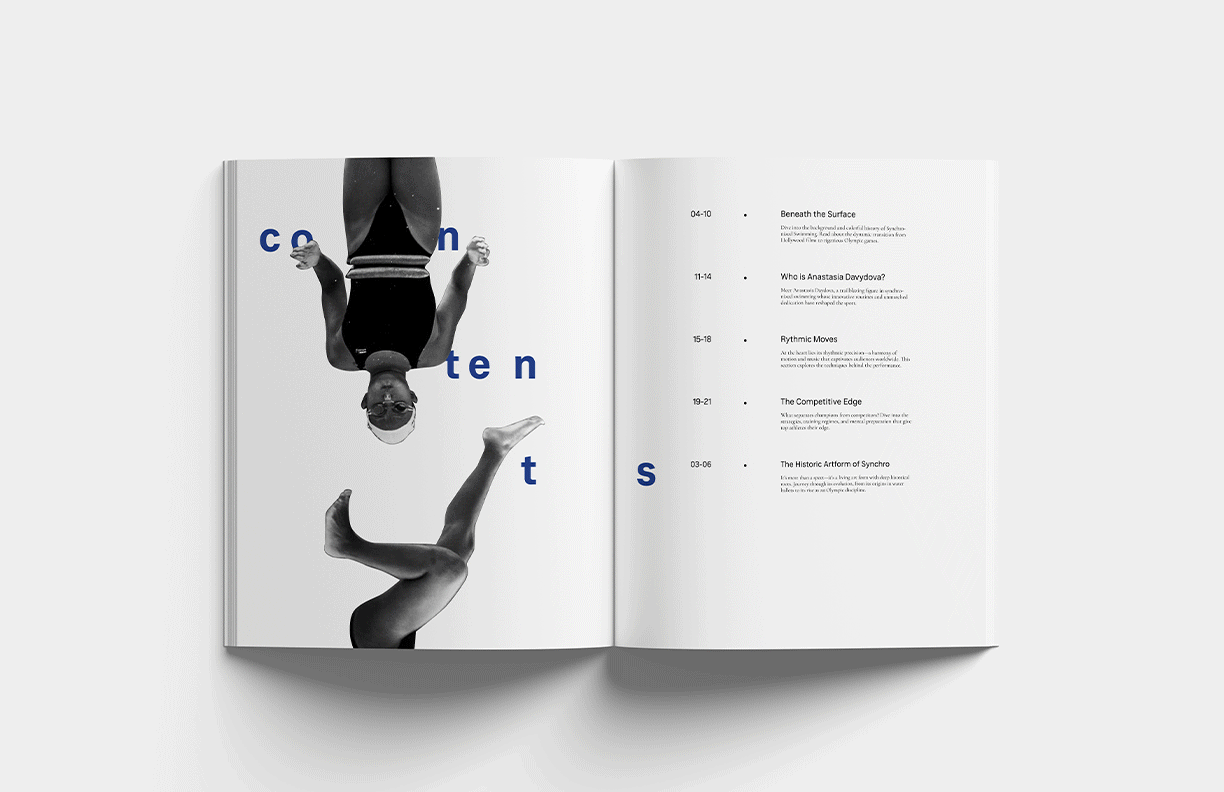
Cadence sweeps you into the athletic art form of Synchronized swimming—a fluid, rhythmic sport blending together technique, tenacity, and precision.
I started by compiling a list of words that describe the identity of the publication and ones that I did not want associated with it.
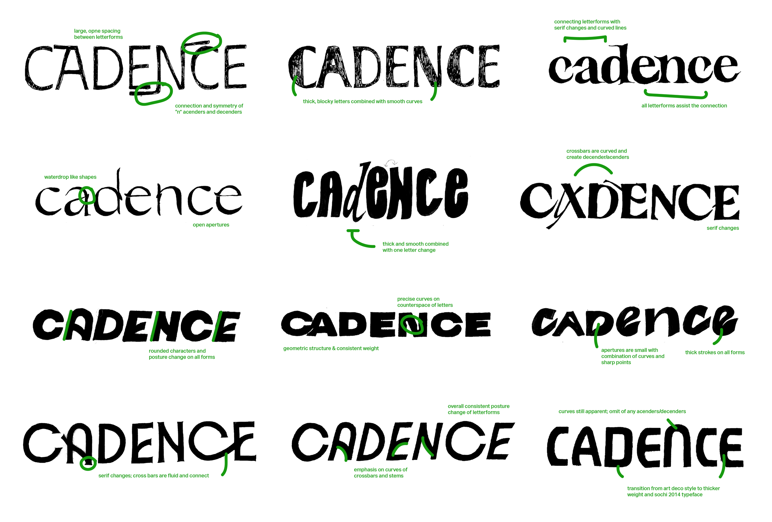
Wordmark sketches
In order to create a wordmark unique to Cadence, it was crucial to experiment with the mechanics of type design. What did a thicker weight signify? Could an introduction of serifs convey athleticism and precision? Are larger apertures appropriate? These were all important questions and ideas tested through sketching.
Final wordmark
Concept
Inspired by the typeface used in the 2014 Winter Olympics in Sochi, a final wordmark was created. Design attributes consist of posture change and a consistent width. Type attributes consist of curved apertures, thick steps, and straight, hefty crossbars. These design elements convey strength, precision, and rhythm that are central to the magazine’s main idea.
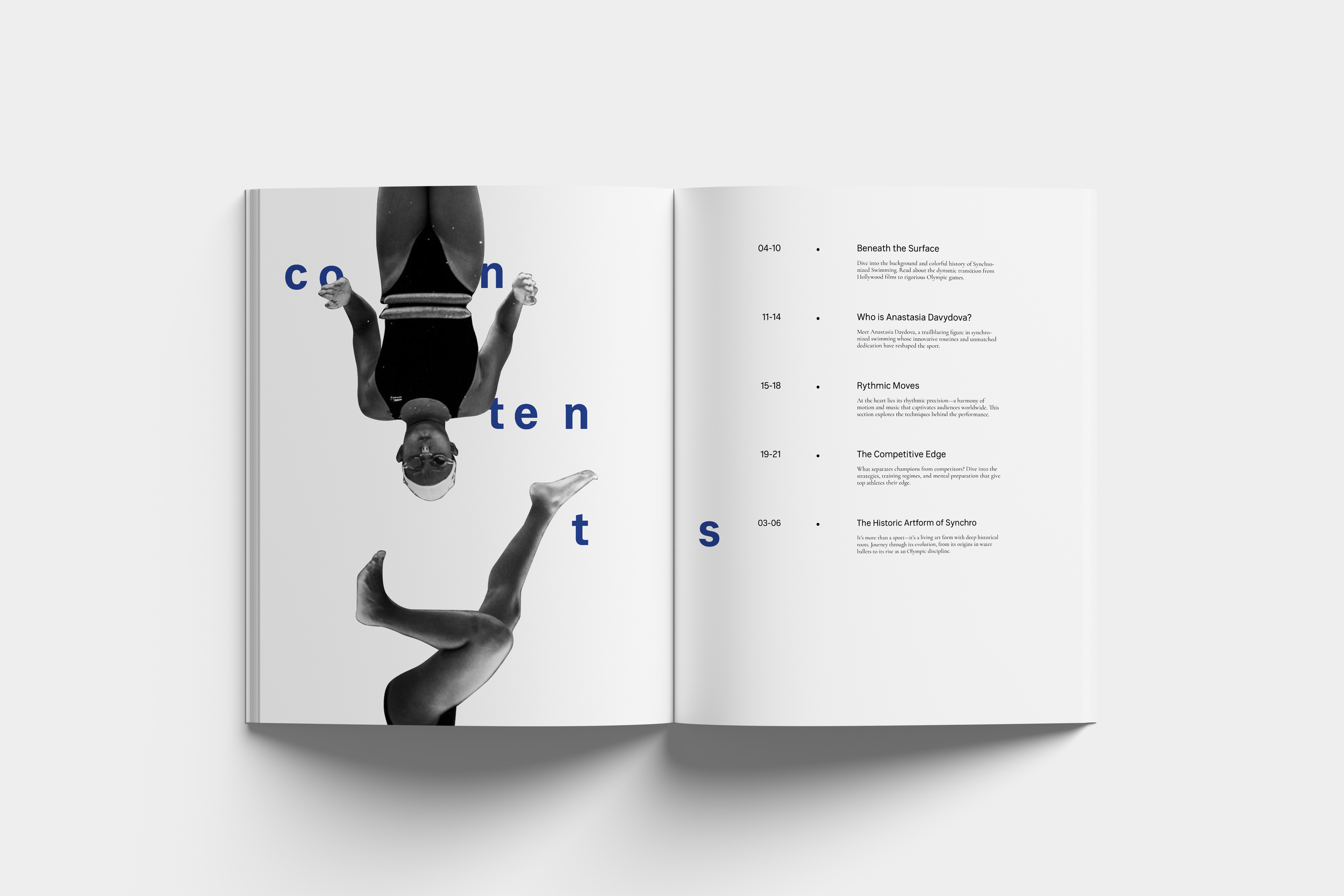
Final Spreads ↓
Who is Cadence?
It is not…
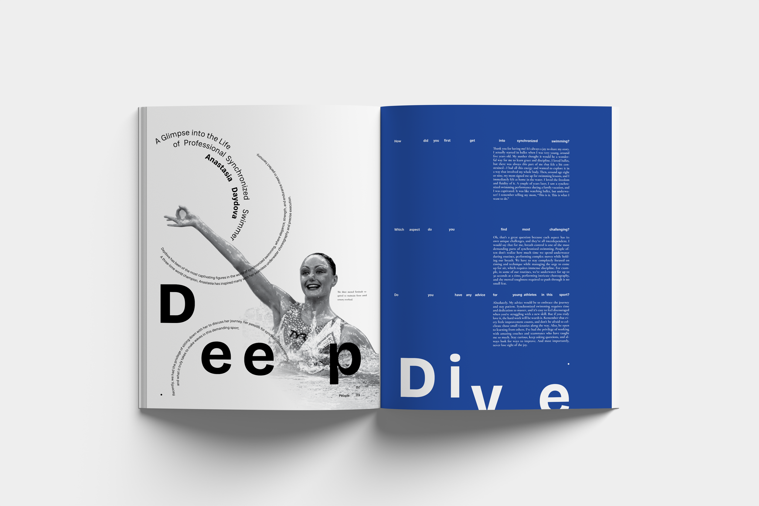
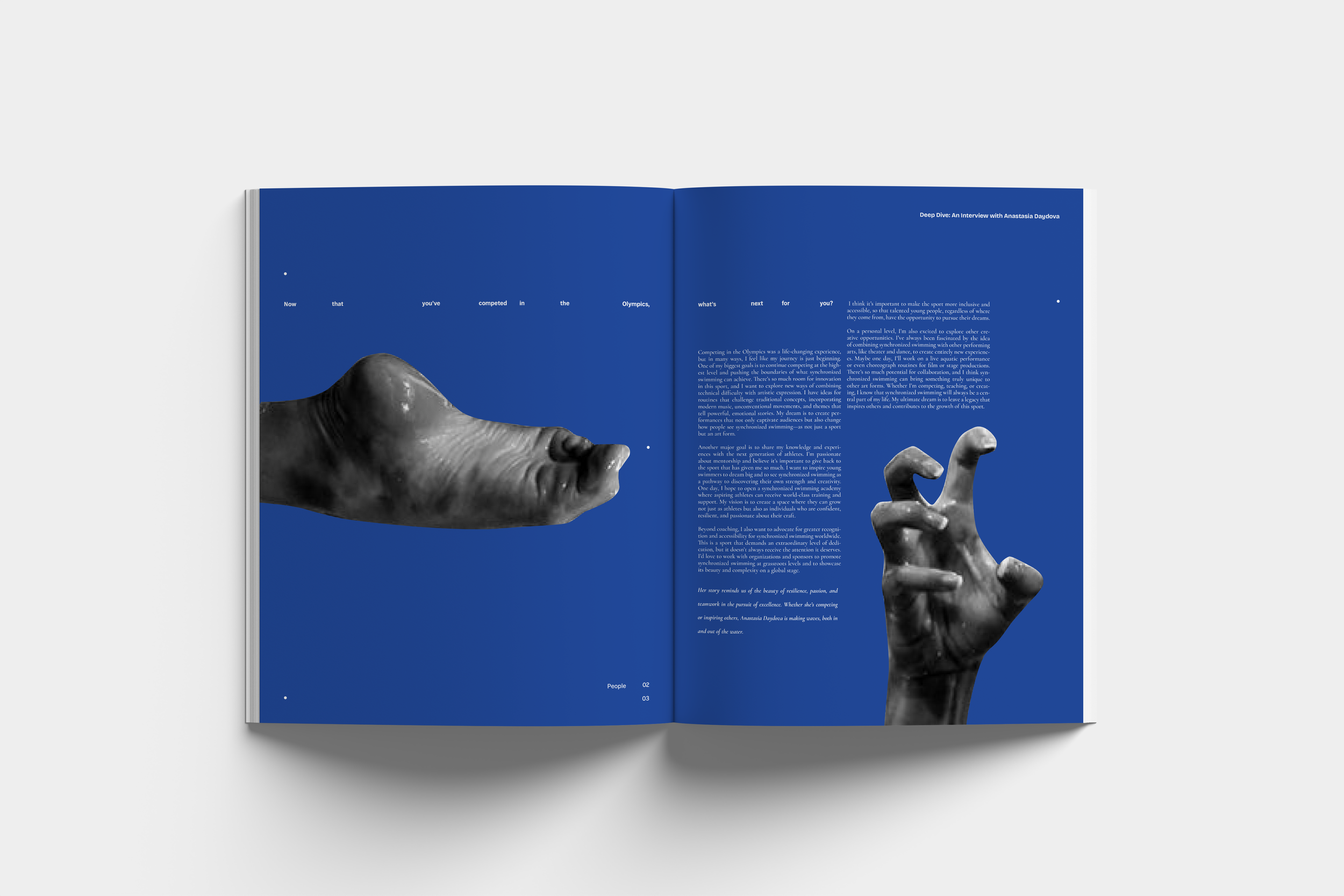
Cadence is a fictional magazine that dives into the nitty-gritty of professional synchronized swimming. It educates on beginner techniques to news in the Olympic world.
The purpose is to explore the deep and overlooked athletes, admire their strength and dedication, and understand what it takes to be the best of the best.
Cadence is…
disciplined
driven
artistic
exciting
tenacious
precise
fluid
rhythmic
weak
lazy
stagnent
resistent
monotonous
inconsistent
simple
rigid