Cult Restaurant Identity
Brand Identity
Typographic Exploration
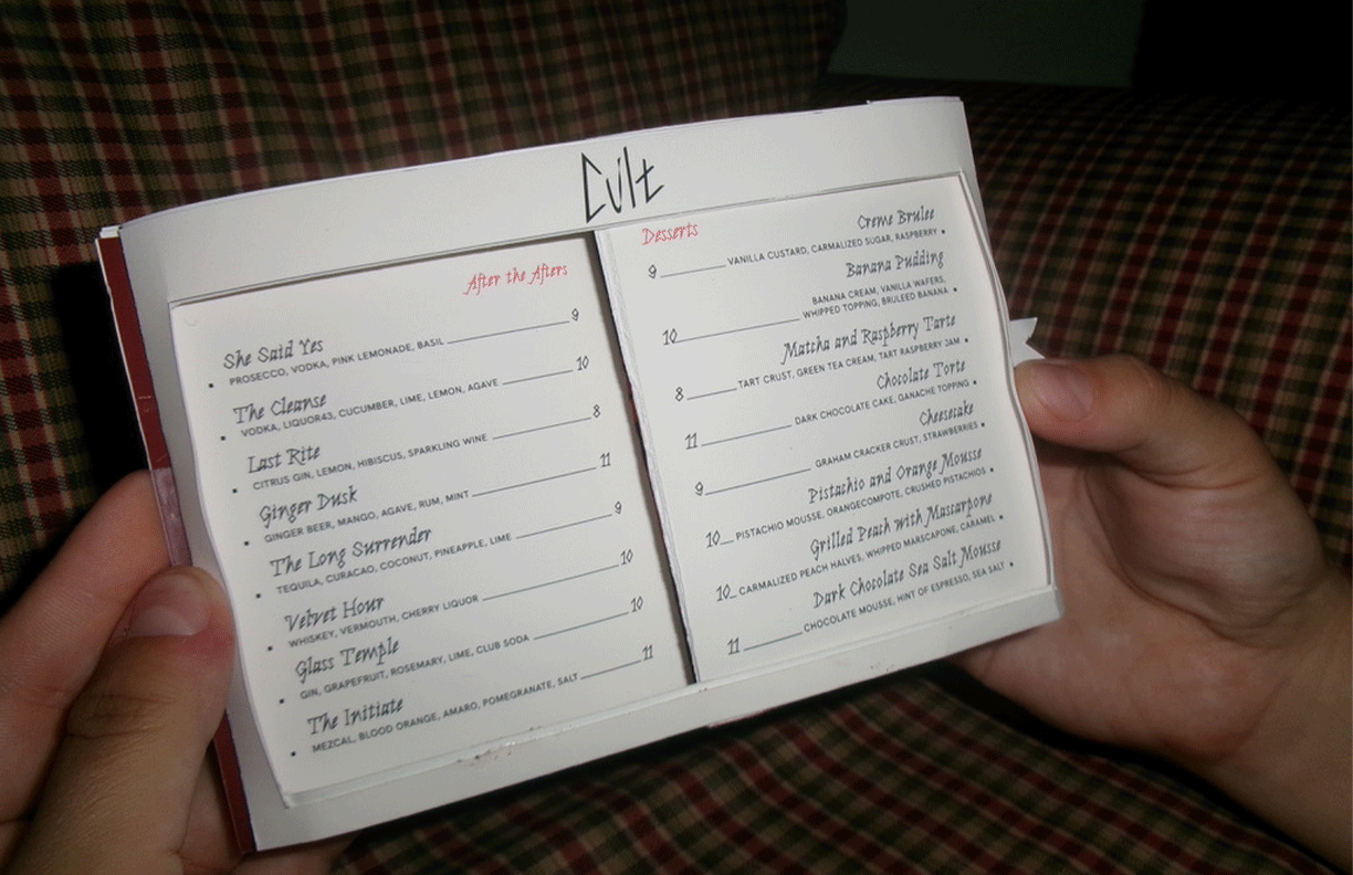
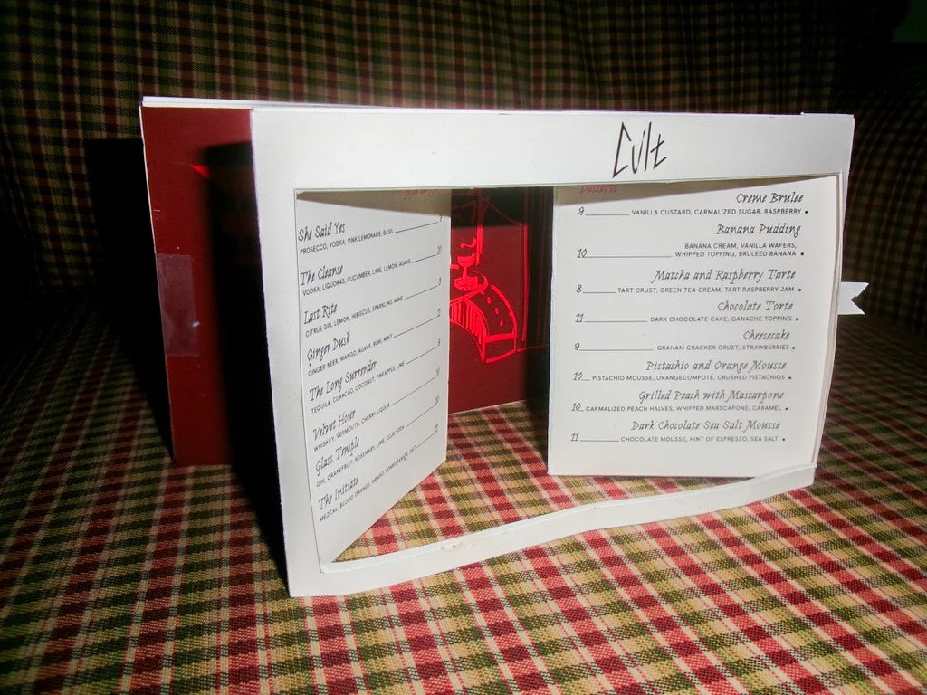
Visual Application
This speakeasy is a quality, jazzy, and intimate experience that thrives off of whispered conversations, stolen stares, and a willingness to dare. This space is a late night cocktail and dessert bar that leaves you wanting more.
Core Values
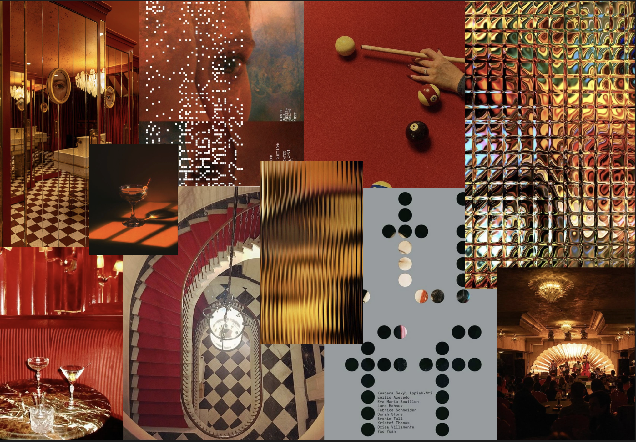
To communicate the visual identity, mood board exploration that aligned with Cult’s core values was integral.
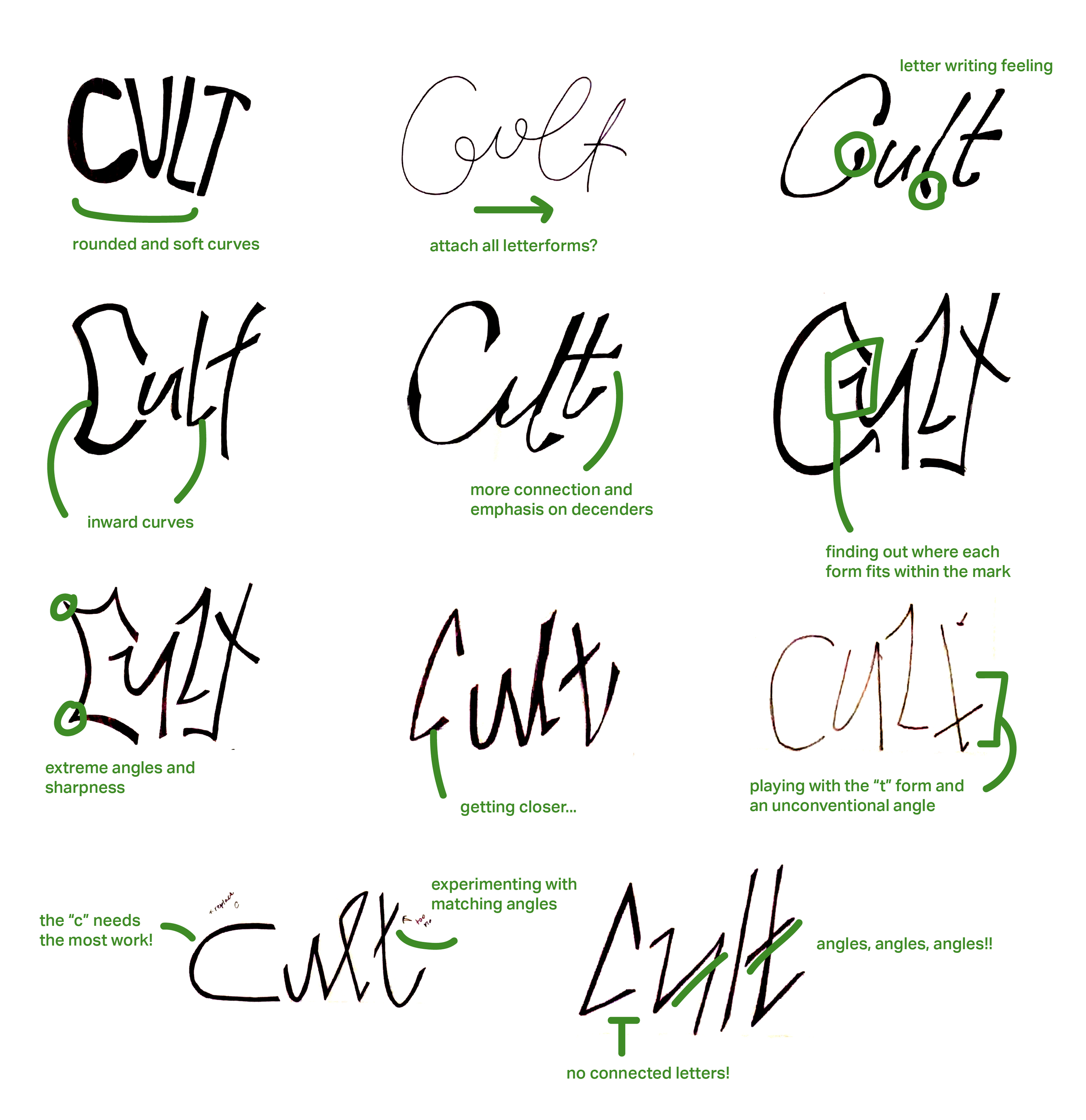
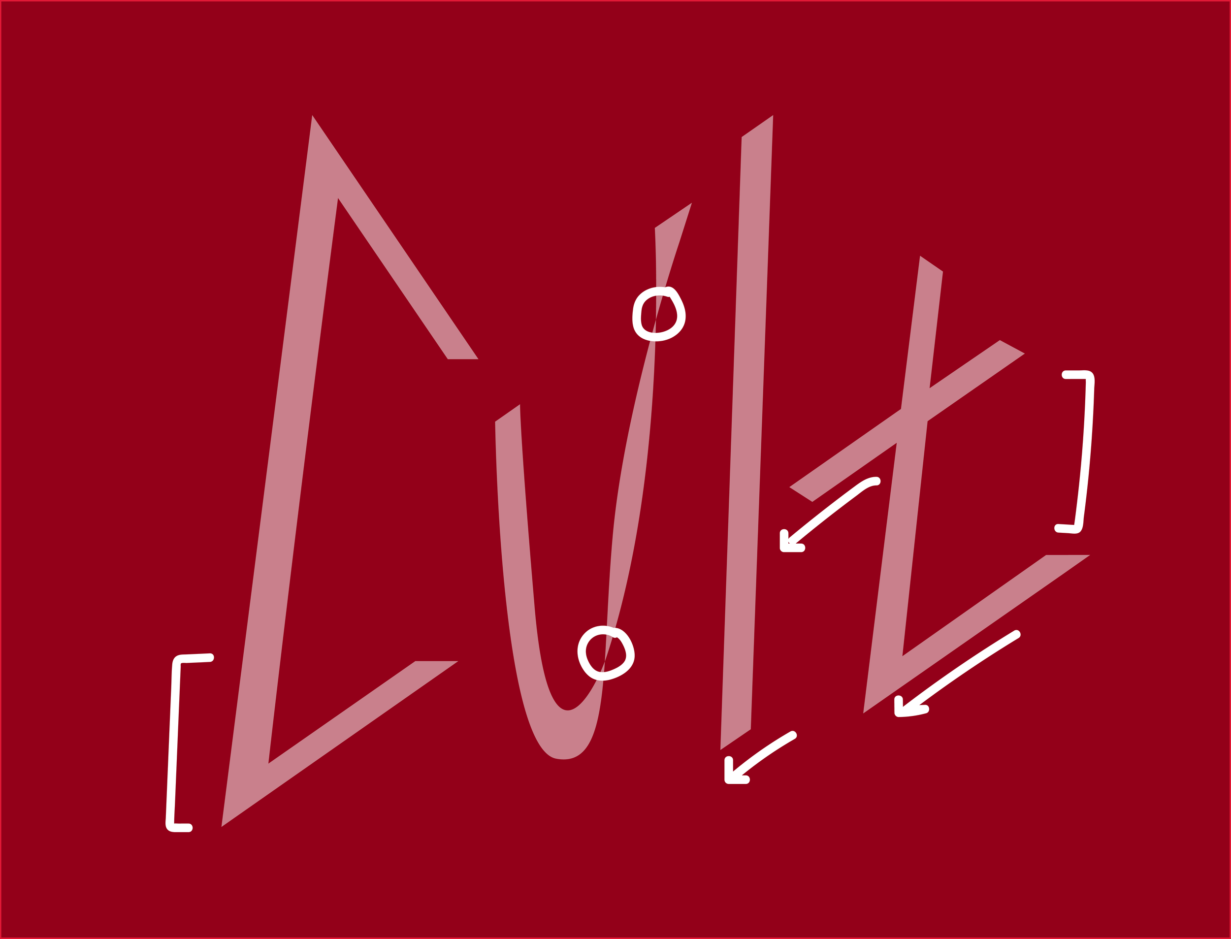
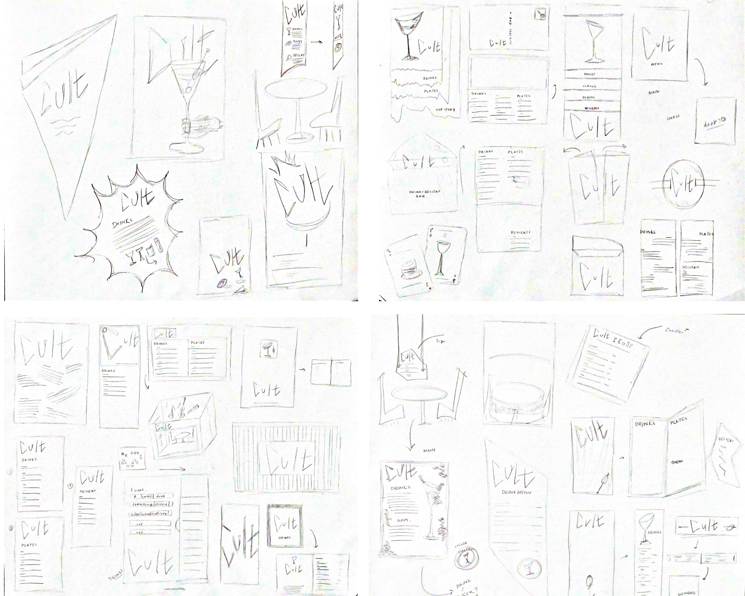
Wordmark Sketches
Initial exploration that focuses on relationship between letterforms, edge, and discovery of angles and curves.
Final Logo
Sharp angles, dynamic curves, and line connection come together in creating a work mark reflective of the brand identity.
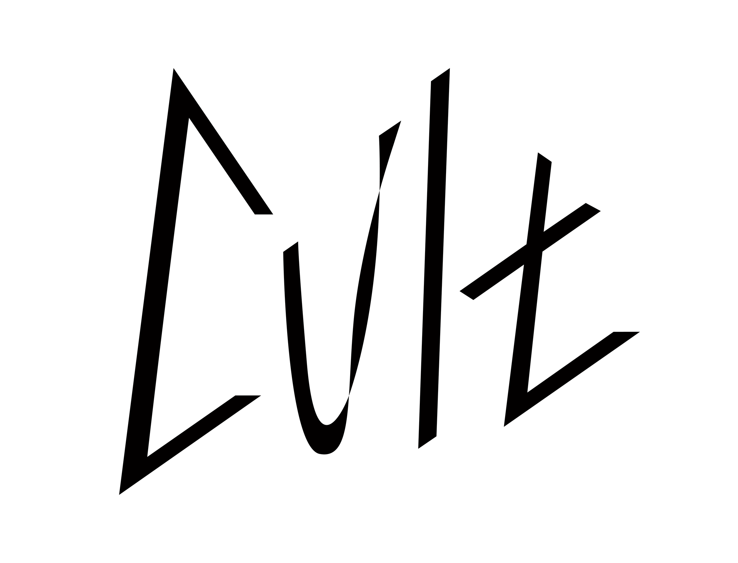
Open counter of “C” and “T” connect the entire mark
Dynamic break in the “U” evokes excitement and changes the simple form with a twist
Angle of “T” cross bar and serifs match
Typography & Color
Roberte is a display typeface that is characterized by it’s daring angles, sharp serifs, and rigid form. Its structure aligns to the characteristics of Cult by defining itself through the unexpected.
Hanken Grotesk compliments Roberte and provides simplicity and a modern approach to the visual identity. When used together, their complimentary yet differentiated structures communicates Cult’s core pillars and a taste of the unique atmosphere the bar evokes.
Who is Cult?
Concept
Cult is a fictional restaurant that focuses on exploring a complete new brand identity that explores secondary and tertiary logos, as well as the application of digital and analog touchpoints.

Additional Elements
To support the development of the visual identity and touch points, a secondary logo and an introduction of a square system were created to further communicate Cult’s message and branding.
Authenticity
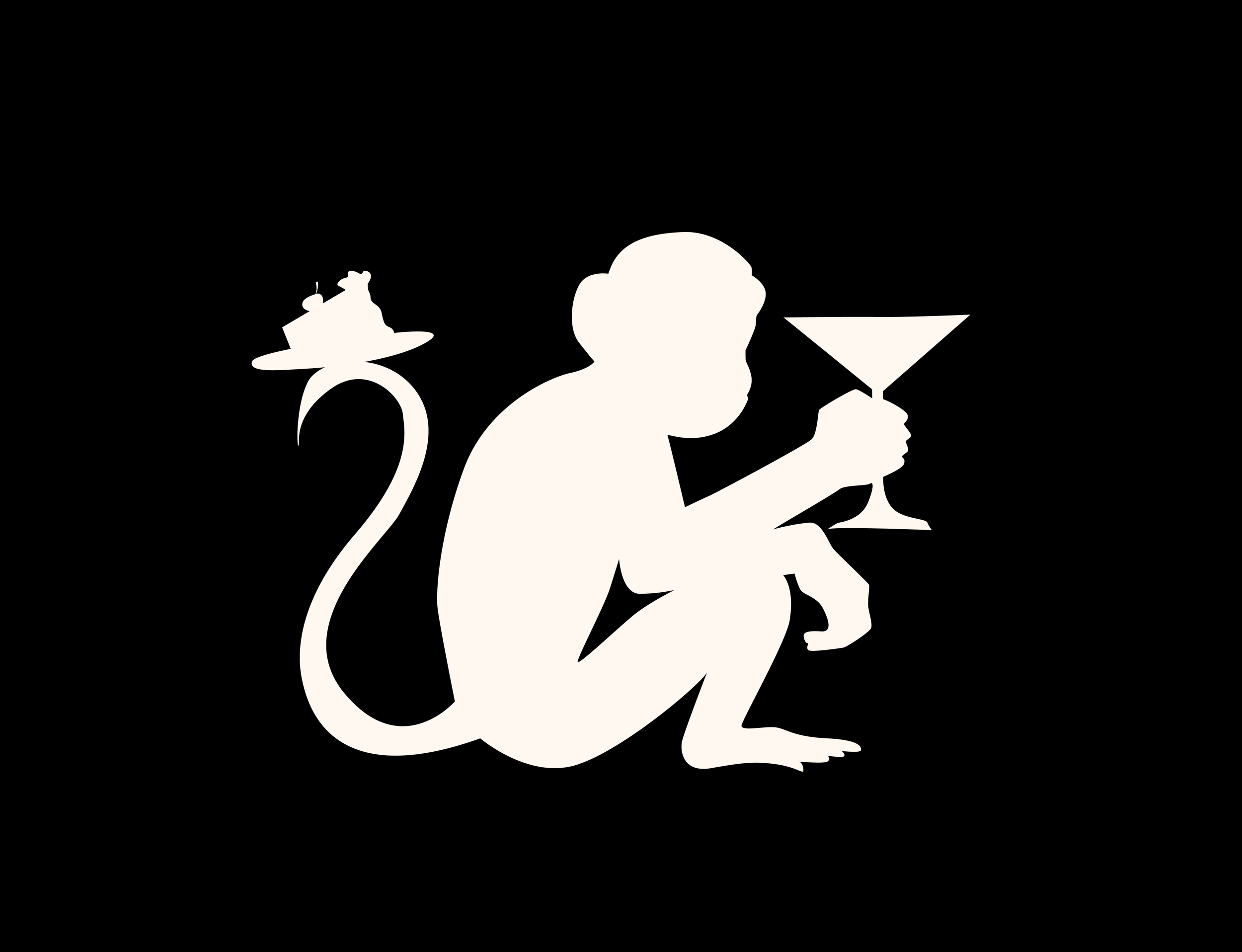
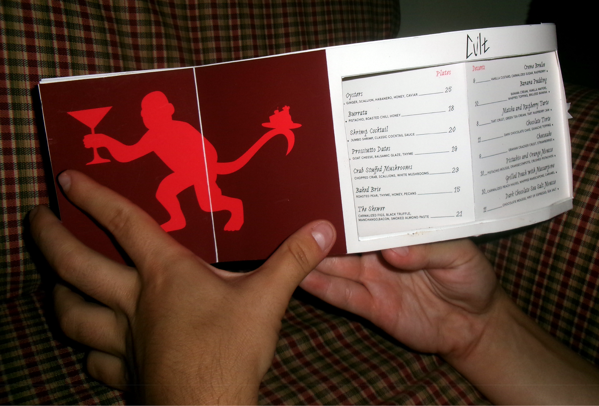
The silhouette of a monkey communicates mischief and playfulness.
Touch Point Exploration
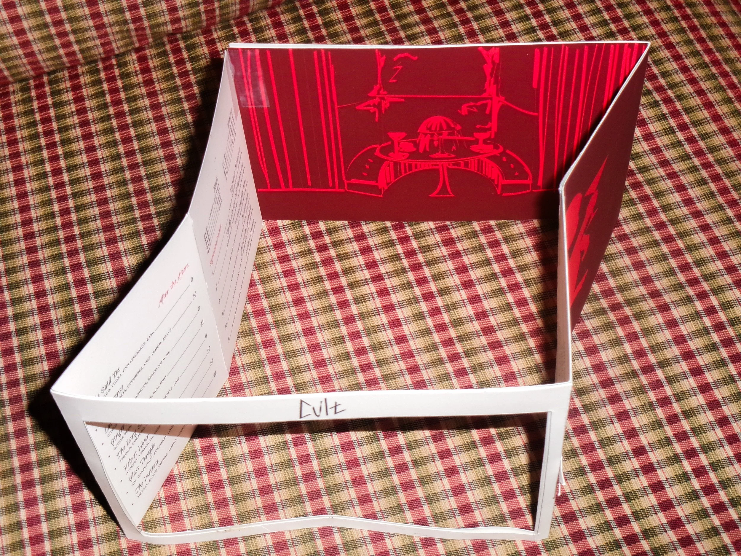
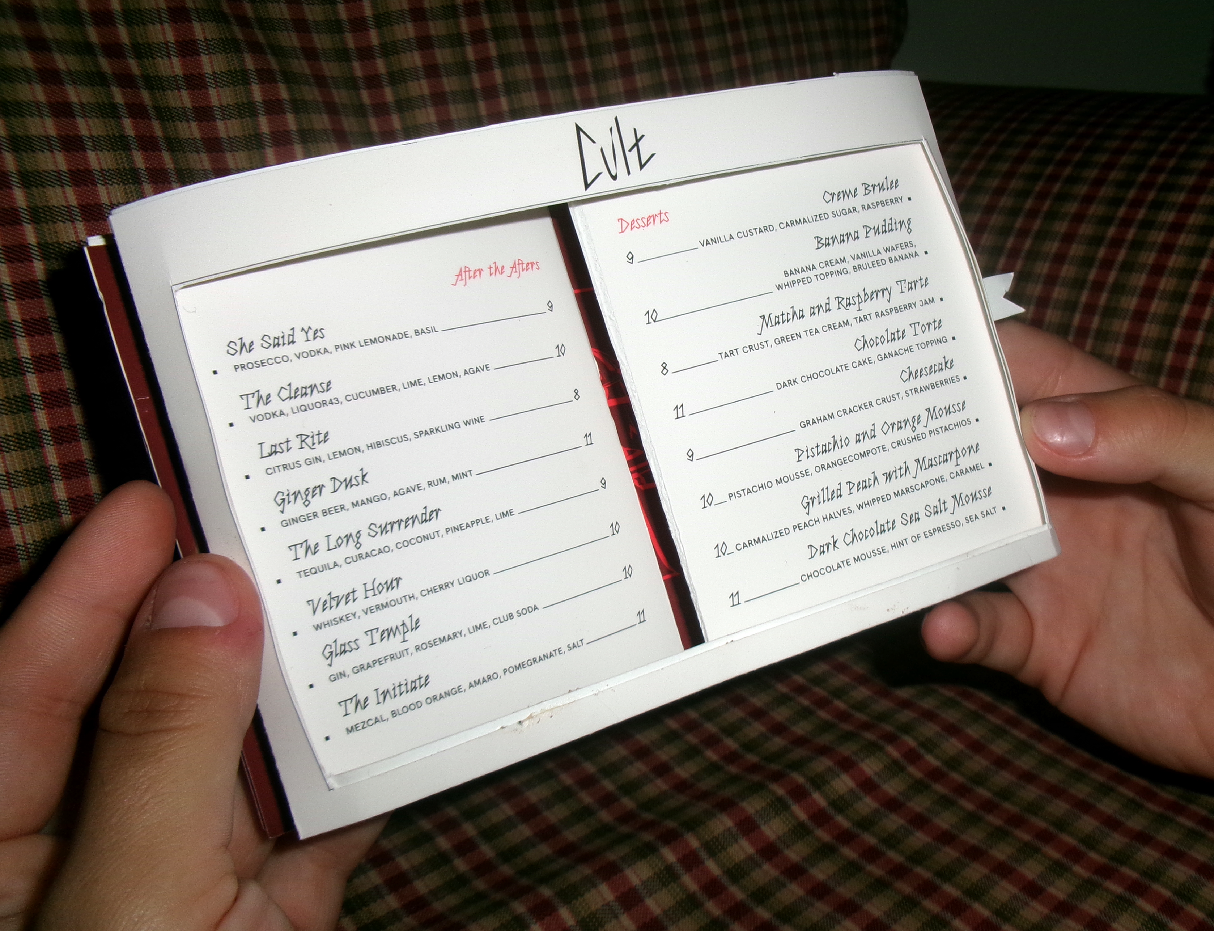
Final Identity ↓
Atmosphere
Craft

Dark, dreamy, and thrilling.
A square grid system alludes to a stairwell and floor tile structure. This system is represented throughout both analog and digital touchpoints.
Discretion